Keeping the Design System Updated – nOps
Keeping the Design System Updated – nOps
Design System – nOps
Design System – nOps
Role: Lead Product Designer
Project: Component Library & System Governance
Platform: SaaS / Cloud Cost Optimization
Objective
To create and maintain a scalable, unified design system that supports rapid product development while ensuring UI consistency, accessibility, and ease of handoff between design and engineering teams.
My Contribution
Audit & Standardization: Reviewed inconsistent UI patterns across the platform and defined a standard set of visual and interactive components.
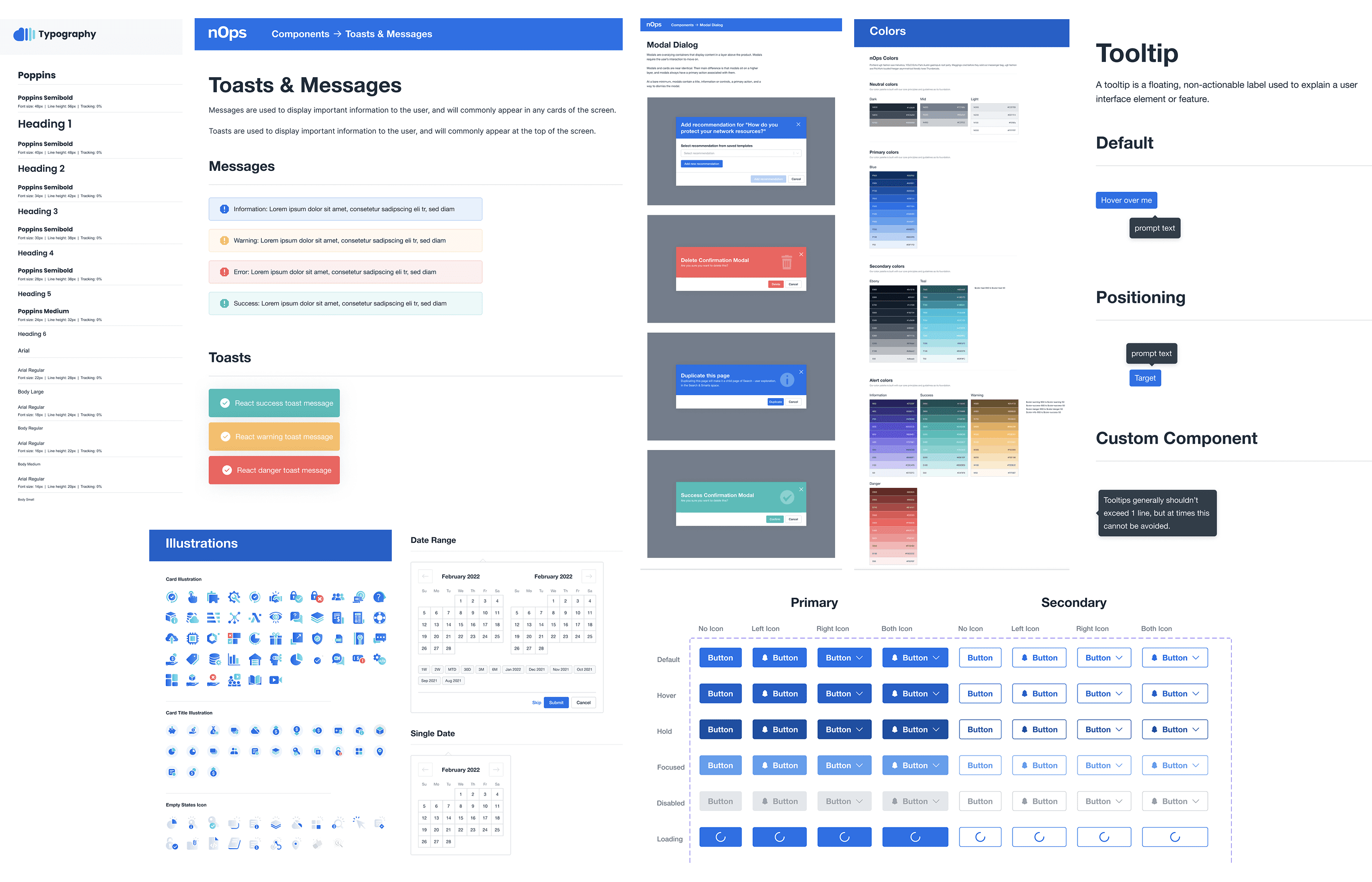
Componentization: Built a structured library including core components like buttons, modals, tooltips, toast messages, and date pickers—optimized for various states and use cases.
Typography & Color Tokens: Established a scalable type hierarchy using Poppins, and defined a robust color palette segmented into primary, secondary, and alert states.
Illustration & Icon System: Curated reusable icon sets and illustrations for visual consistency and clarity across data-heavy dashboards.
Documentation & Handoff: Maintained clear documentation within Figma, collaborated closely with engineers, and ensured design tokens aligned with front-end code via Storybook.
Impact
Reduced design-to-dev handoff time by ~30%
Increased interface consistency and developer adoption across teams
Enabled faster onboarding for new designers and developers
Supported faster feature rollouts with fewer visual regressions
Role: Lead Product Designer
Project: Component Library & System Governance
Platform: SaaS / Cloud Cost Optimization
Objective
To create and maintain a scalable, unified design system that supports rapid product development while ensuring UI consistency, accessibility, and ease of handoff between design and engineering teams.
My Contribution
Audit & Standardization: Reviewed inconsistent UI patterns across the platform and defined a standard set of visual and interactive components.
Componentization: Built a structured library including core components like buttons, modals, tooltips, toast messages, and date pickers—optimized for various states and use cases.
Typography & Color Tokens: Established a scalable type hierarchy using Poppins, and defined a robust color palette segmented into primary, secondary, and alert states.
Illustration & Icon System: Curated reusable icon sets and illustrations for visual consistency and clarity across data-heavy dashboards.
Documentation & Handoff: Maintained clear documentation within Figma, collaborated closely with engineers, and ensured design tokens aligned with front-end code via Storybook.
Impact
Reduced design-to-dev handoff time by ~30%
Increased interface consistency and developer adoption across teams
Enabled faster onboarding for new designers and developers
Supported faster feature rollouts with fewer visual regressions
Typography System
Typography System
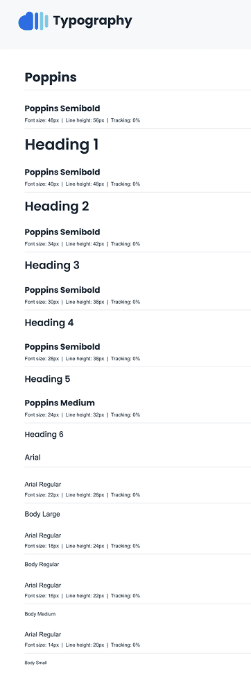
To ensure clear hierarchy and visual harmony across the platform, I defined a scalable typography system using Poppins and Arial.
Key Highlights:
Heading Levels (H1–H6): Poppins Semibold for strong, modern visual structure
Body Text: Arial Regular for readability across data-heavy screens
Consistent Line Heights & Font Sizes: Optimized for clarity and balance on both web and mobile interfaces
Role-based Variants: Included styles for large, regular, medium, and small body text to support dashboard UI and microcopy
This typography system played a crucial role in maintaining accessibility, responsiveness, and aesthetic consistency throughout the nOps platform.
To ensure clear hierarchy and visual harmony across the platform, I defined a scalable typography system using Poppins and Arial.
Key Highlights:
Heading Levels (H1–H6): Poppins Semibold for strong, modern visual structure
Body Text: Arial Regular for readability across data-heavy screens
Consistent Line Heights & Font Sizes: Optimized for clarity and balance on both web and mobile interfaces
Role-based Variants: Included styles for large, regular, medium, and small body text to support dashboard UI and microcopy
This typography system played a crucial role in maintaining accessibility, responsiveness, and aesthetic consistency throughout the nOps platform.
Toasts & Messages – nOps Design System
Toasts & Messages – nOps Design System
Ensure consistent, accessible, and informative UI alerts that align with user expectations and nOps’ visual language.
My Contribution
Designed inline message banners for Information, Warning, Error, and Success states with clear iconography and semantic colors.
Developed React-based toast components for real-time alerts, maintaining visual alignment with system messages.
Ensured accessibility compliance through contrast ratios, screen-reader support, and keyboard navigation.
Documented usage guidelines for developers and product teams to ensure consistent application across the product.
Impact
Enhanced system clarity and user confidence during key actions like deletion, submission, and errors.
Reduced UI inconsistencies across engineering teams through clear documentation and Figma components.
Improved overall UX by giving users timely, visually distinct feedback in both passive and interruptive forms.
Ensure consistent, accessible, and informative UI alerts that align with user expectations and nOps’ visual language.
My Contribution
Designed inline message banners for Information, Warning, Error, and Success states with clear iconography and semantic colors.
Developed React-based toast components for real-time alerts, maintaining visual alignment with system messages.
Ensured accessibility compliance through contrast ratios, screen-reader support, and keyboard navigation.
Documented usage guidelines for developers and product teams to ensure consistent application across the product.
Impact
Enhanced system clarity and user confidence during key actions like deletion, submission, and errors.
Reduced UI inconsistencies across engineering teams through clear documentation and Figma components.
Improved overall UX by giving users timely, visually distinct feedback in both passive and interruptive forms.
Modal Dialog – nOps Design System
Modal Dialog – nOps Design System
Objective
To define a consistent and accessible modal system that supports key user flows like confirmations, warnings, form actions, and success messages—while aligning with nOps’ design language.
My Contribution
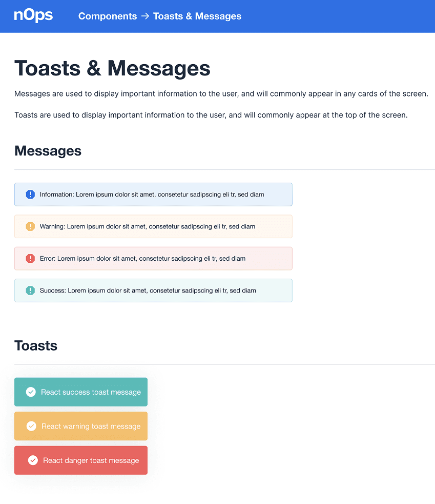
Designed modal variants for different intent types: Info, Warning, Error, and Success.
Ensured visual clarity with color-coded headers, contextual icons, and clear primary/secondary CTA hierarchy.
Included dismiss actions (X icon) and ensured full keyboard navigation and screen reader support.
Created a flexible layout for both form-based inputs and simple confirmations.
Delivered Figma components and documented usage patterns for consistent implementation.
Impact
Standardized modal behavior across the platform, reducing cognitive load for users during critical actions.
Improved accessibility and UX clarity, particularly for destructive actions like deletions.
Enabled faster feature development by offering pre-built, documented modal variants to engineers.
Objective
To define a consistent and accessible modal system that supports key user flows like confirmations, warnings, form actions, and success messages—while aligning with nOps’ design language.
My Contribution
Designed modal variants for different intent types: Info, Warning, Error, and Success.
Ensured visual clarity with color-coded headers, contextual icons, and clear primary/secondary CTA hierarchy.
Included dismiss actions (X icon) and ensured full keyboard navigation and screen reader support.
Created a flexible layout for both form-based inputs and simple confirmations.
Delivered Figma components and documented usage patterns for consistent implementation.
Impact
Standardized modal behavior across the platform, reducing cognitive load for users during critical actions.
Improved accessibility and UX clarity, particularly for destructive actions like deletions.
Enabled faster feature development by offering pre-built, documented modal variants to engineers.
Color System – nOps Design System
Color System – nOps Design System
Objective
To define a flexible, accessible, and brand-aligned color system that supports UI theming, user feedback states, and design scalability across the nOps platform.
My Contribution
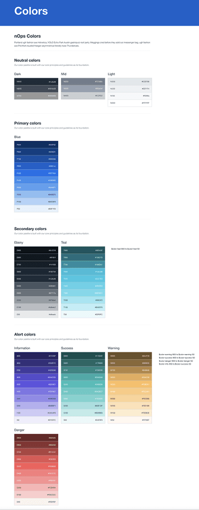
Developed a structured token-based color system covering:
Neutral Colors (Dark, Mid, Light) for layout and content hierarchy
Primary Colors (Blues) for action-driven elements and branding
Secondary Colors (Ebony & Teal) for thematic flexibility
Alert Colors (Info, Success, Warning, Error) for feedback messaging
Assigned semantic naming conventions (e.g., B500, E300) to improve engineering collaboration.
Ensured WCAG-compliant contrast across backgrounds, buttons, and text.
Created Figma swatches and provided implementation specs for frontend teams.
Impact
Improved visual clarity and brand cohesion across the app’s interface.
Enabled rapid theme development for different feature modules.
Reduced inconsistencies in color usage by standardizing design tokens across design and codebases.
Objective
To define a flexible, accessible, and brand-aligned color system that supports UI theming, user feedback states, and design scalability across the nOps platform.
My Contribution
Developed a structured token-based color system covering:
Neutral Colors (Dark, Mid, Light) for layout and content hierarchy
Primary Colors (Blues) for action-driven elements and branding
Secondary Colors (Ebony & Teal) for thematic flexibility
Alert Colors (Info, Success, Warning, Error) for feedback messaging
Assigned semantic naming conventions (e.g., B500, E300) to improve engineering collaboration.
Ensured WCAG-compliant contrast across backgrounds, buttons, and text.
Created Figma swatches and provided implementation specs for frontend teams.
Impact
Improved visual clarity and brand cohesion across the app’s interface.
Enabled rapid theme development for different feature modules.
Reduced inconsistencies in color usage by standardizing design tokens across design and codebases.